Top Ten Tuesday: Top Ten Covers I Wish I Could Redesign


A meme from the Broke and the Bookish.
Today’s topic: Top Ten Covers I Wish I Could Redesign
1. Beka Cooper Series, especially Mastiff

Seriously, her neck is broken, her clothes are photo-shopped on, her arms were attached to the wrong part of her body. Her hair is supposed to be dark blonde. Ahhh!!!!

None of the female characters are blonde… NONE!
3. Daughter of Smoke and Bone I did a previous post about this issue here.

The colors are right but it doesn’t tell you enough and the colors are on the wrong things!

It just feels too light and fluffy and pretty to me. I like the overlay but it just doesn’t fit to me.
5. Liesl & Po

I just have a general dislike of when the image depicts an event that never actually happens.
6. Coraline (The Graphic Novel)

Buttons: They are described as shank, but lie flat on a plate and the one on the cover is definitely sew-through.
7. The Loud Silence of Francine Green

My big complaint is the feet. The shoes make her look like a little girl. It makes it feel like a book for a 5-year-old.
8. Just Ella

I like the concept, of the one on the left which I read, but the execution is oh so dated. Some of these have better covers out there but to me this alternate cover makes it look like it is about a prom queen.
9. Ashes

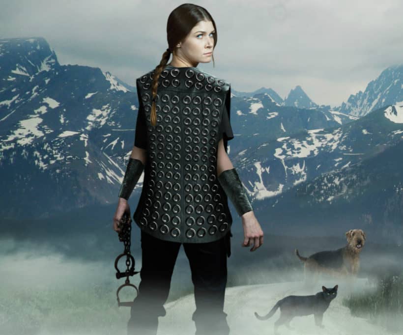
It is a very creepy cover but it doesn’t convey anything about the book really.

This character is supposed to be poor and covered in mud and miserable for half of this book. To me it looks like a book about a princess, or at least a wealthy girl. Decked in gold with her hair clean and her eyes perfectly done…
11. BONUS: The book I am currently reading! The Book of Taltos by Steven Brust… Vlad should have a mustache and a jhereg should be small enough that he can have one on each shoulder, and he doesn’t wear any sort of glove for them to land on.
Venting done!


