Booking Through Thursday: Cover Story Part 2


A meme from Booking Through Thursday.
Today’s topic is “The flip side of last week’s … Are there any good books that you read IN SPITE OF the cover and ended up wondering what on earth the artist and publisher were thinking to pair up a cover that so badly represented a perfectly good book? And … if you didn’t like the cover, what made you pick up the book? The author? Assigned reading from school? A recommendation from a friend?”

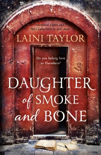
Daughter of Smoke and Bone by Laini Taylor
I picked this up at ALA or mom did. The blurb on the back definitely sounded like a me book. I think the fact that I kept reading good reviews from other bloggers finally convinced me to give it a chance. I love LOVE love LOVE love this book! As far as the cover: I like the font, but the image just doesn’t do it for me. It is very Photoshopped, that girl is not wearing that mask. She has no expression. You can’t tell if this is supposed to be a historical masquerade, an angsty teenager or what. She isn’t engaging. It just really didn’t do anything for me. Afterwords it made slightly more sense but still. The color of the mask has significance, but the mask itself is not that color and not even in the same time frame of the book as that blue. I can see what they were going for but it didn’t work for me. I like some of the others that have happened since better.
Some of these are foreign:


There is also some really cool fan art out there for this book. I really like the movie posters created by skellingt0n over at deviantART: first and second. She does really cool mockups for a lot of awesome books. You should check them out.
I think this is definitely the top of my list for the cover not doing it for me, but I think this is also one of those books where I liked it so much it is hard for the cover to seem good enough. Though I think accuracy is very big for me. Take for example Tamora Pierce’s books: they are not really covers that wow people and they get a hard time for being dated but they are accurate. I look at them and I see the story. I remember what happens. Though the Beka Cooper books someone seriously needs to lay off the Photoshop. Take a look at the Mastiff cover on this wiki, look at it full size and you won’t be able to help but hear her neck snapping. If it weren’t Tamora Pierce that kind of thing would send me running.
Last time I talked about other blogs with interesting cover things they do. Today the Unfortunate Covers of 100 Scope Notes come to mind.
Do you have a book you love that you almost didn’t read because of the cover? Or maybe one that you are tempted to cover in brown paper when you read it?


